Courage And Co 1949–1955

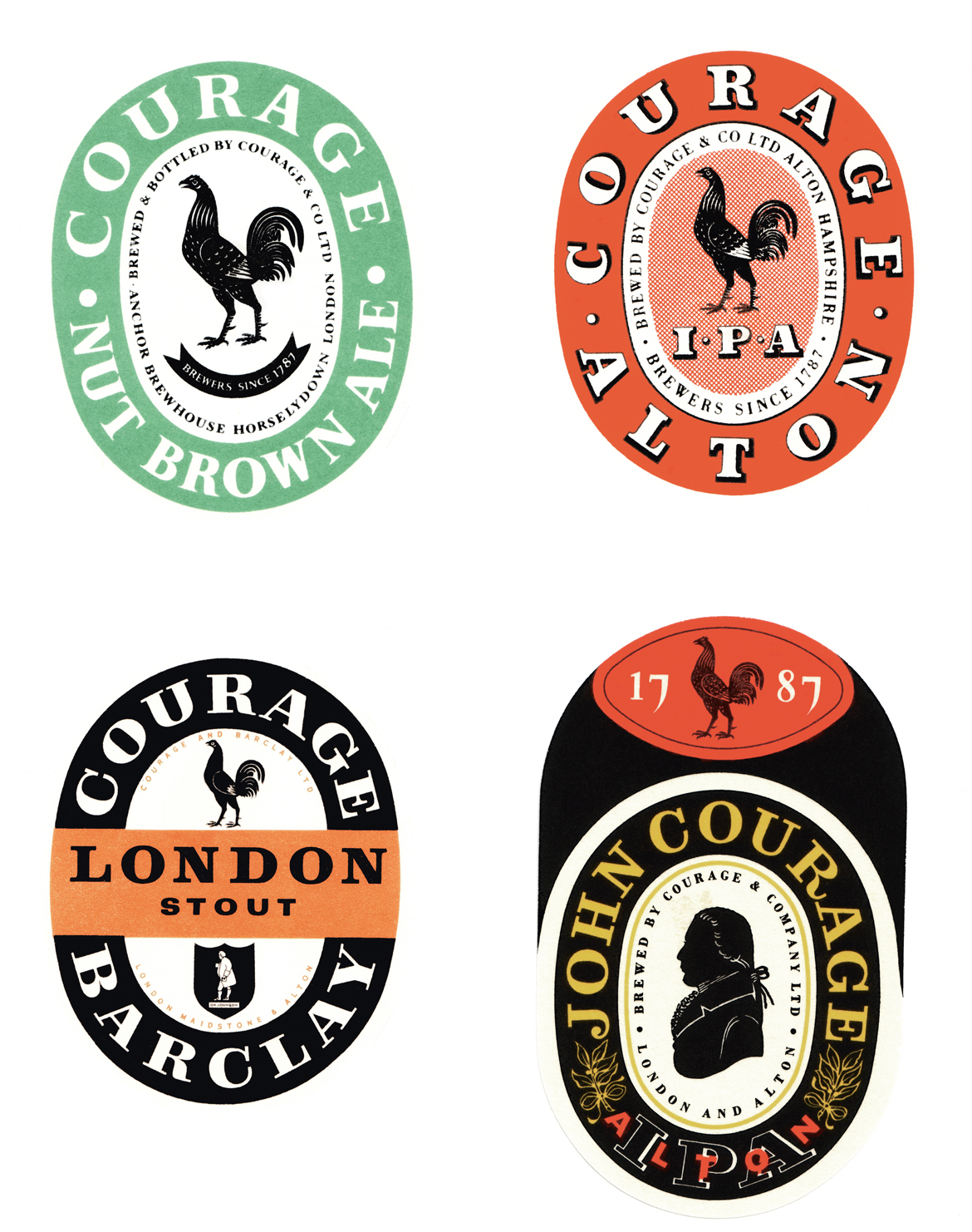
In the 1950’s Milner Gray’s graphics department started to shape the future for the Unit. With a flow of commissions for corporate design work that would set new standards in British industry. Between 1949 and1955 DRU worked as consultants to develop the corporate identity for Courage and Co. Using the Courage golden cockerel symbol from the Courage family’s coat of arms, the image was used on the exterior of the company’s houses, on their fleet and inside the pubs and on bottle labels.
The largest and most experimental commission for the Brewery Watney Combe Reid radically re-positioned the image of the British public house. The Unit produced a ‘House Identification Manual’ dividing Watneys Public houses into five architectural-style groups and devising guidelines for typefaces, application methods and interior designs for each. Their consultancy work spanned more than fifteen years from 1956–1970 with all the branded detail work for each pub.
You're looking for exceptional architecture. We're looking for exceptional projects. Let's start a conversation
Enquire
